COVID-19 Content Portal
public health
The relationship between vaccination rates and COVID-19 cases and deaths in the USA
By Ensheng Dong and Lauren Gardner
Sep 21, 2021
Over one and a half years since the first COVID-19 case was reported in the USA, multiple states are reporting their highest case and hospitalization rates to date. Unfortunately, the latest summer wave of COVID-19, and the resulting harm from it, was preventable. The vast majority of individuals in the US over the age of twelve have access to a free, and highly effective COVID-19 vaccine. However, many have chosen not to accept one.
As of September 7, 2021, more than 373 million COVID-19 vaccine doses have been administered in the US (JHU CSSE), translating to slightly more than half of the total population being fully vaccinated. This level of vaccination is far below the required rate for herd immunity, especially given the circulation of the highly infectious Delta variant, which was responsible for over 90% of new cases as of August (1). Although the effectiveness of the vaccines in preventing infection and transmission is lower for the Delta variant, the vaccines are still serving their primary purpose, which is to prevent severe illness, hospitalizations and death, critically reducing the load on the overburdened healthcare system (2).
This analysis serves to illustrate the relationship between vaccination uptake and COVID-19 harm in the US. Specifically, we compare the county level vaccination rates as of June 16, against the total number of new cases and deaths reported between July 1 to September 1 (normalized by population), during which time the Delta variant was the dominant strain. We first fit two linear regression models, one between the vaccination rate and case incidence rate, and a second between the vaccination rate and mortality rate, for all counties in the US with available data. We separately fit models to subsets of counties based on defining characteristics such as political affiliation, land use, average household income, education rates and the social vulnerability index (SVI) to compare trends and identify any disproportionate vaccination behaviors or COVID-19 impacts across the groups.
The objectives of this research are the following: 1) to illustrate, with data, the effectiveness of COVID-19 vaccines in reducing virus transmission at a population level, and more critically, reducing deaths resulting from COVID-19, 2) to reveal any disproportionate behaviors in vaccine uptake and/or COVID-19 harm amongst counties based on certain defining characteristics and 3) to identify vulnerable counties in the US that should be targeted for increased vaccination uptake.
The data and results are presented and discussed below.
Lauren GardnerCounties that voted Republican in the 2020 Presidential election, are more rural, have lower average household income levels and education rates, and are more socially vulnerable are more likely to have lower vaccination coverage rates and higher incidence and mortality rates from COVID-19 over the summer period evaluated.
Data
The incidence rate (IR) and mortality rate (MR) are calculated for each county as the number of new cases and deaths per 100,000 persons reported between July 1 to September 1, respectively. The case and death data are sourced from JHU CSSE (3) and the population data is from the US Census Bureau. Some counties are excluded from the analysis due to missing data at the county level, such as Nebraska cases and deaths, and Florida deaths.
The vaccination rate (VR) is sourced from Georgetown University’s US COVID-19 Vaccination Tracking website (4), whose dataset is a composite of the CDC and state reporting (5). The composite nature of the data set corrects for inaccuracies in CDC vaccination data (including Colorado, Georgia, New Mexico, Texas, Virginia, West Virginia, Vermont) and augments the CDC data set to include Texas and Hawaii, which are excluded from the CDC data set entirely (6). The data available from Georgetown University includes the complete vaccination coverage rates at discrete points in time. The complete vaccination coverage is defined as “the cumulative proportion of the total population that has received two doses of the Pfizer or Moderna COVID-19 vaccine or one dose of the J&J COVID-19 vaccine, completing the vaccine regimen needed for full protection.” The vaccination rate is reported for the entire population in each county, and not distributed by age group. For this work, we use the vaccination rates for June 16 and September 16.
The partisanship assignment for each county is based on the 2020 presidential election results at the county level sourced from the MIT Election Data + Science Lab (7). From this data, each county is assigned as either Republican or Democrat.
The land use classification of urban or rural is based on the urban population percentage sourced from the US Census Bureau (8). If the urban population percentage is greater than 50%, then we designate that county as urban, and rural otherwise.
The household income data is sourced from the Civic Impact govex GtiHub repository (9). We assign each county to a quantile based on its median income, which is split according to the following thresholds: $43,880, $50,978, and $59,240.
Education rates are based on the percent of adults with less than a high school diploma, which is sourced from the USDA Economic Research Service (10). We generate quantiles split according to the following thresholds: 8.54%, 11.88%, and 17.02%.
The Social Vulnerability Index (SVI) is created by CDC to describe the preparedness for hazardous incidents (11). A higher index translates to a less vulnerable location. The SVI is defined using socioeconomic status, household composition and disability, minority status and language, and housing type and transportation. In this work we use the overall vulnerability score (ranging from 0 to 1), and assign counties into quantiles based on the following thresholds: 0.25, 0.50, and 0.75.
Lauren GardnerThe groups of high-risk counties, which primarily lie in the Southeastern region of the US, should be targeted for education and outreach campaigns, to inform the populations on the true risks and benefits of COVID-19 vaccines, in order to protect them from further COVID-19 harm.
Results
Results from the analysis are below, and reveal 1) if there is a statistically significant relationship between vaccination rates and COVID-19 case incidence (and mortality) rates for the entire country, and if so, what that relationship is, and 2) whether vaccination rates and/or case incidence (and mortality) rates vary for counties based on their political affiliation, land use, average household income, education rates and the social vulnerability index (SVI).
National and State level analysis
Figure 1 includes heat maps illustrating the county level (a) incidence rate and (b) mortality rate for the period between July 1 and September 1, and plots the national level (c) weekly cases and (d) weekly deaths over the entire outbreak period. States with the highest infection rate during the summer 2021 cluster in the South and Southeastern region of the US, and include Louisiana, Florida, Mississippi, Arkansas, Alabama, Tennessee, South Carolina, Georgia, Kentucky, and Oklahoma. Many of these states also report the highest mortality rates over summer 2021, namely Louisiana, Mississippi, Arkansas, Florida, Nevada, Missouri, Delaware, Wyoming, Alabama, and Texas. The ten states with the highest case incidence and mortality rates are highlighted in Figure 1(a) and 1(b) with a bold red outline, and the number of cases and deaths attributed to this set of states are color-coded with red in figures 1(c) and 1(d), respectively. Florida does not provide county-level deaths data, but its state-level mortality rate during the summer is among the Top 10 states. Cases and deaths in these top ten states account for 40.02% and 50.40% of the new weekly cases and deaths during the summer period, respectively.
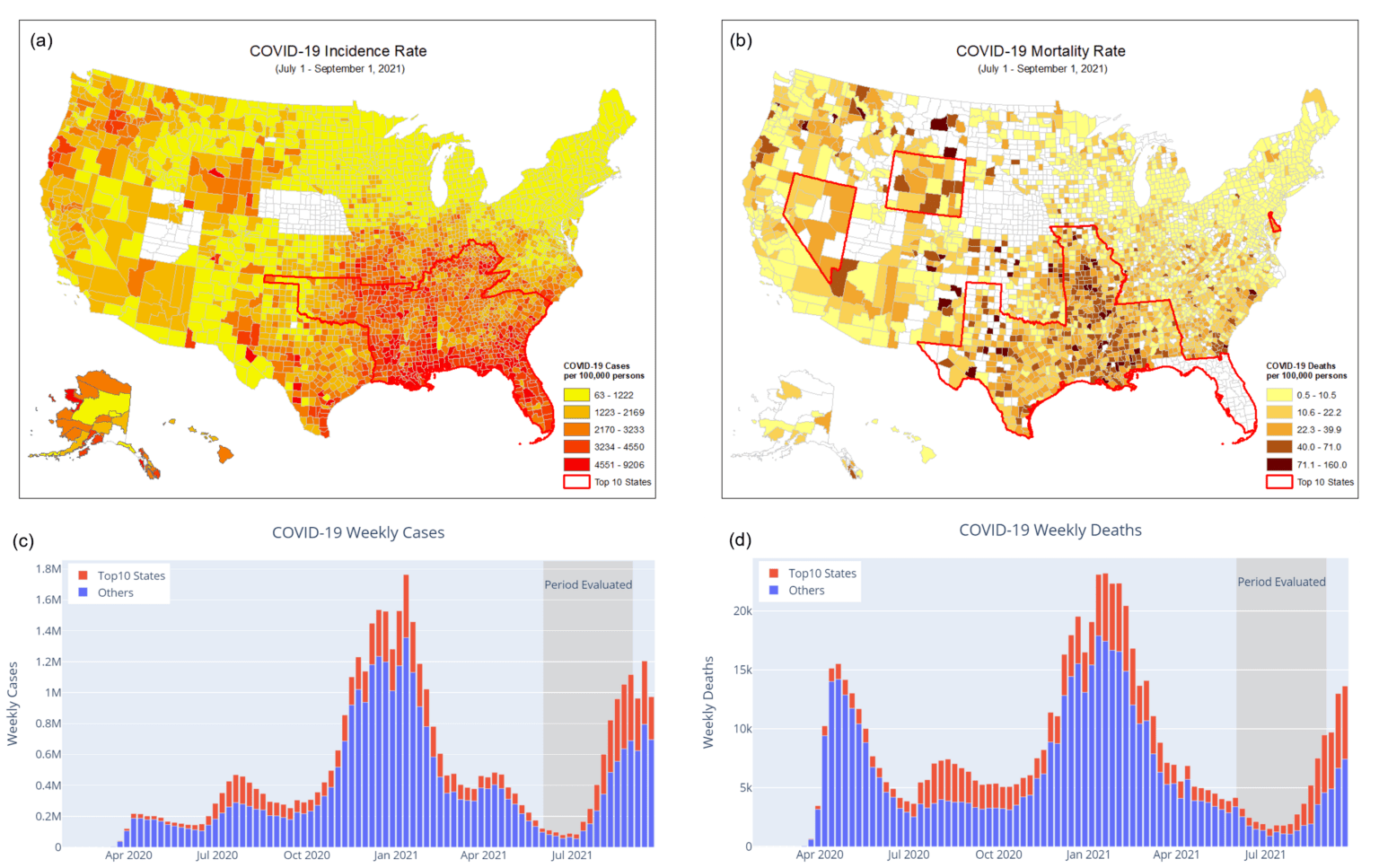
Figure 1. The US COVID-19 case incidence and mortality rates between July 1 and September 1, 2021. (Data Source: JHU CSSE)
1) Case incidence rate (cases per 100,000 people). The top 10 states with the highest incidence are highlighted with a bold red outline. 2) Mortality rate (deaths per 100,000 people). The top 10 states with the highest mortality are highlighted with a bold red outline. 3) Weekly cases. New cases from the top 10 states with the highest incidence rate during the summer are color-coded with red. 4) Weekly deaths. New deaths from the top 10 states with the highest mortality rate during the summer are color-coded with red.
Figure 2 illustrates the vaccination rates for the US. Figure 2(a) is a heat map of the vaccination rates for all counties in the US based on the June 16 complete vaccination coverage. Figure 2(b) is a set of box and whisker plots of the distribution of vaccination rates over all counties for each state, which are ranked from left to right according to the median vaccination rate for the state; the ten states with the highest incidence rates over summer are colored in red. The national average vaccination rate is represented by the horizontal dotted line. The ten states with the highest incidence rate have vaccination rates below the national average, many of which fall among the set of states with the lowest vaccination rates.
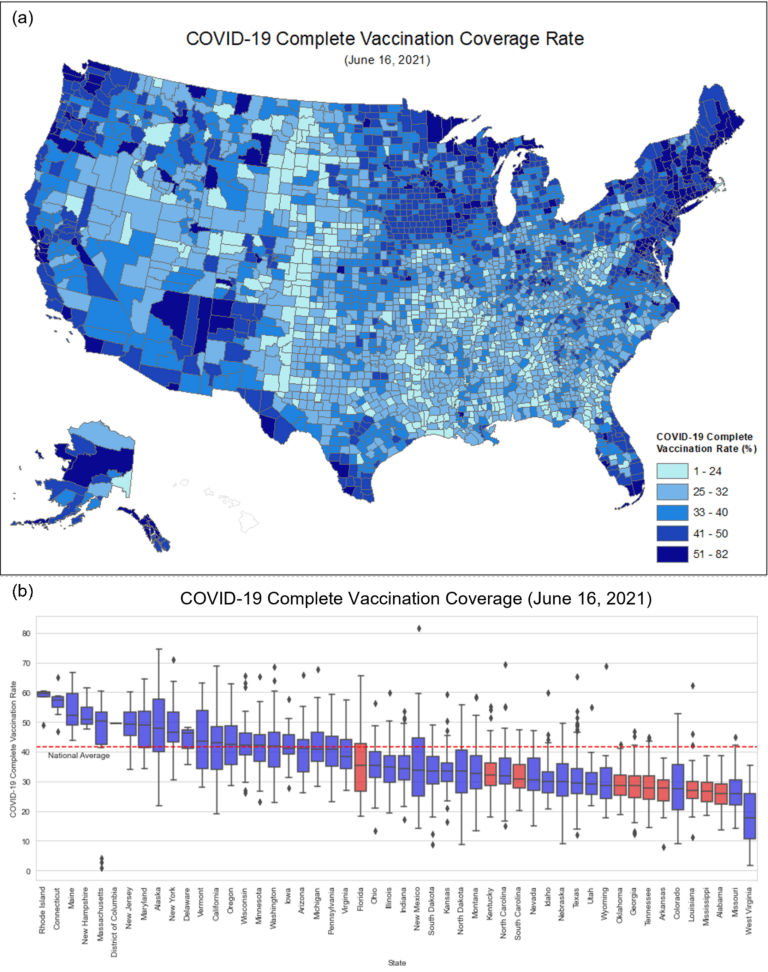
Figure 2. (a) Heat map of complete vaccination coverage on June 16, 2021. (b) Box and whisker plots of the complete vaccination coverage for each state. The top 10 states with the highest incidence are highlighted in red. (Vaccination Coverage Data Source: US COVID-19 Vaccination Tracking)
Figure 3 illustrates the fitted linear regression model between (a) vaccination rate and incidence rate and (b) vaccination rate and mortality rate for all US counties with available data. The model reveals a statistically significant negative correlation between the vaccination coverage and both incidence rate and mortality rate, with a stronger negative correlation for the latter. For visualization purposes, the y-axis and the regression line are drawn using the logarithm of the incidence or mortality rates.
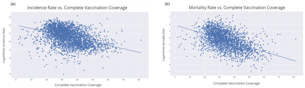
Figure 3. Scatter plots and regression lines for the June 16 complete vaccination coverage and July 1-September 1 (a) incidence rate and (b) mortality rate.
Disproportionate Vaccination Uptake and COVID-19 Harm across US counties
Figure 4 illustrates how the vaccination rates differ amongst counties based on political affiliation, land use, average household income, education rates and the social vulnerability index (SVI). Critically, we observe varying behavior in vaccination uptake rates (and the impact of COVID-19) amongst these subgroups of counties. On average, there are lower vaccination rates and higher COVID-19 case incidence and mortality rates in counties that are Republican (vs Democrat), rural counties (vs urban), have lower average household incomes, fewer individuals with high school diplomas, and a higher SVI.
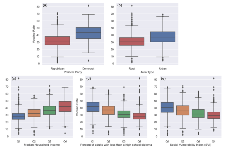
Figure 4. The complete vaccination coverage as of June 16 among different subgroups of counties according to (a) political affiliation, (b) land use, (c) average household income level, (d) education level, and (e) SVI.
Political Partisanship. COVID-19 policies and mitigation efforts have been highly politicized throughout the pandemic. For example, Republicans and Fox News viewers tend to hold more negative attitudes towards vaccines and be less willing to get vaccinated (12, 13), while Democrats are more likely to partake in COVID-19 control policies such as social distancing (14). As a result, partisan bias has significantly impacted behavior, risk perception, and thus, virus spread. Figure 5 illustrates the differing behavior towards vaccinations among the counties based on their political leaning relative to the impact of COVID-19 in terms of new cases and deaths over the summer. Republican-leaning counties have, on average, lower vaccination rates, and higher case incidence and mortality rates. There also exists a statistically significant, strong negative correlation between the vaccination rate and the case incidence and mortality rate for both sets of counties, with a stronger negative correlation between vaccination and mortality rates.
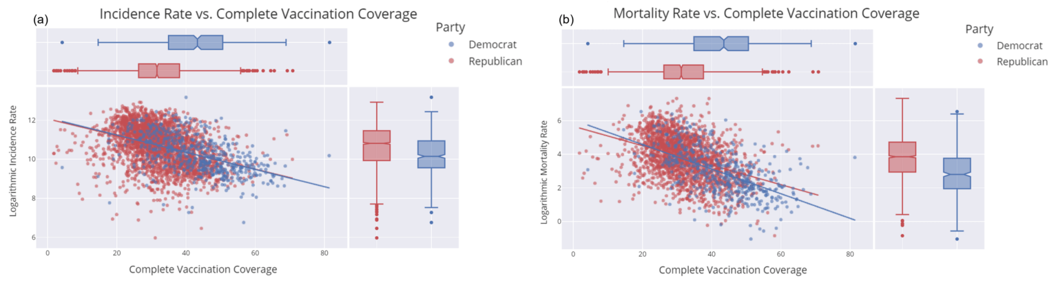
Figure 5. Scatter plots and regression lines based on political partisanship for (a) vaccination rate and incidence rate and (b) vaccination rate and mortality rate.
Land-use. We also explore the observable difference in vaccination uptake and COVID-19 case incidence and mortality rates between urban and rural counties. We categorize counties according to their land-use classification, and model the pairwise correlation for both subgroups (Figure 6). The results reveal that on average vaccine coverage in urban areas is higher than in rural areas. The case incidence rates are similar between the two sets of counties, however, the mortality rates are lower in urban areas relative to rural areas. There is a statistically significant negative correlation between vaccination rates and case incidence and mortality rates for both subgroups of counties.
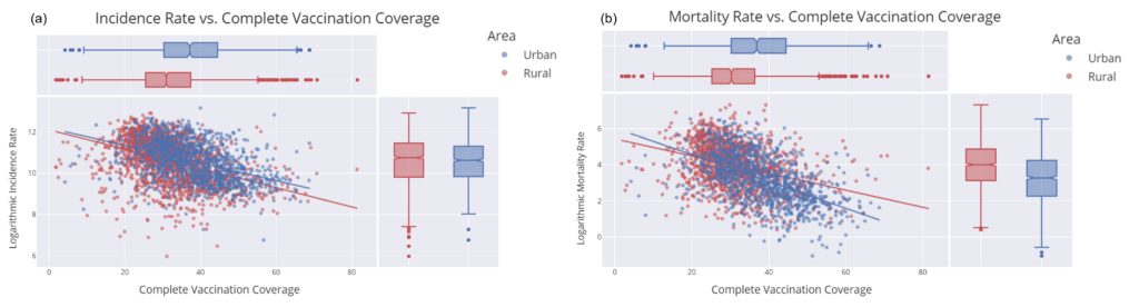
Figure 6. Scatter plots and regression lines based on area type: urban or rural: (a) incidence and vaccination rate, (b) mortality and vaccination rate.
Household income. When we categorize counties according to their median household income we again find variability in both vaccination uptake rates and COVID-19 case incidence and mortality rates. On average, counties with higher median household income have higher vaccination rates, and lower case incidence and mortality rates. We also find a statistically significant negative relationship between vaccination rate and case incidence (and mortality rate) for all subgroups (see Figure 7).
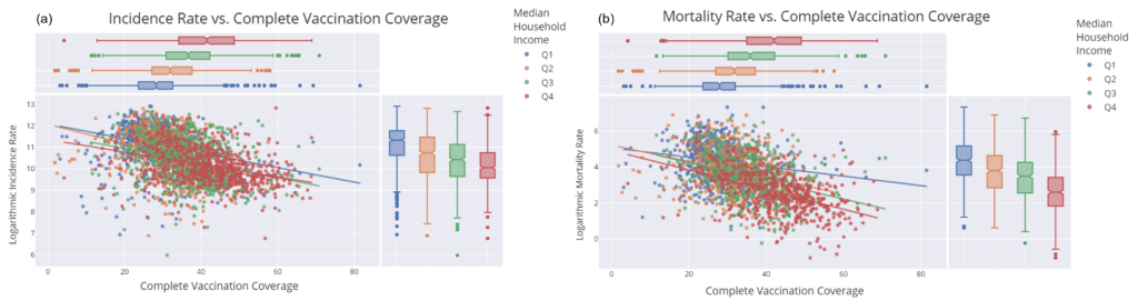
Figure 7. Scatter plots and regression lines based on the median household income in 2018: (a) incidence and vaccination rate, (b) mortality and vaccination rate. Q1 means the median household income is below $43,880; Q2 is between $43,880 to $50,978; Q3 is between $50,978 to $59,240; Q4 is above $59,240. All correlations are statistically significant.
Education. Education level is measured by the percentage of adults with less than a high school diploma. We find that vaccination rates are lower in counties with higher rates of incomplete high school education; these counties also have higher incidence and mortality rates. All education subgroups have a statistically significant negative correlation between the vaccination rate and case incidence (and mortality rate).
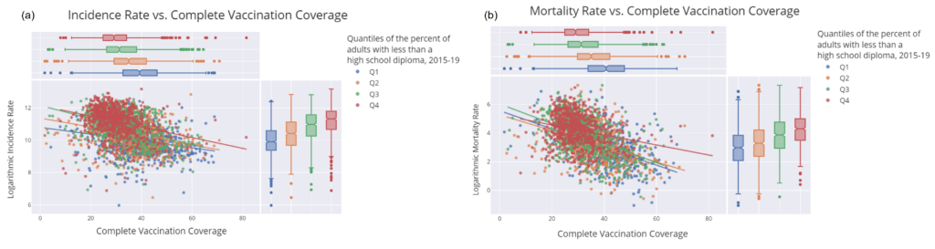
Figure 8. Scatter plots and regression lines based on the percent of adults with less than a high school diploma (2015-19): (a) incidence and vaccination rate, (b) mortality and vaccination rate. Q1 means the percentage of adults with less than a high school diploma is below 8.54%; Q2 is between 8.54% to 11.88%; Q3 is between 11.88% to 17.02%; Q4 is above 17.02%. All correlations are statistically significant.
Social Vulnerability Index (SVI). Finally, we group counties based on the CDC social vulnerability index, which is a comprehensive risk analysis of the overall public health situation for every county. A higher SVI means the county is less vulnerable and more resilient. Figure 9 illustrates that counties with higher SVI have lower vaccination coverage and higher incidence and mortality rates. All SVI subgroups present a statistically significant negative correlation between their vaccination rate and case incidence (and mortality rate).
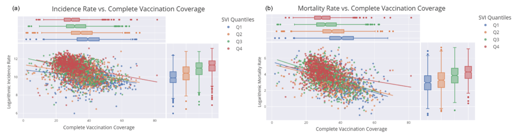
Figure 9. Scatter plots and regression lines based on the Social Vulnerability Index (SVI) in 2018: (a) incidence and vaccination rate, (b) mortality and vaccination rate. Q1 means the median household income is below 0.25; Q2 is between 0.25 to 0.50; Q3 is between 0.50 to 0.75; Q4 is above 0.75. All correlations are statistically significant.
Changes in Vaccination Rate
Between June 16 and September 16 vaccination rates increased in all states. During this period the national average vaccination rate climbed from 41.70% to 50.39% (green and red lines in Figure 10, respectively). However, the states with the highest case incidence and mortality rates over the summer period (shaded in red and blue, respectively, with purple shading indicating the state lies on both lists) still, by far, have amongst the lowest vaccination rates, and all but Delaware fall well below the national average for vaccination coverage.
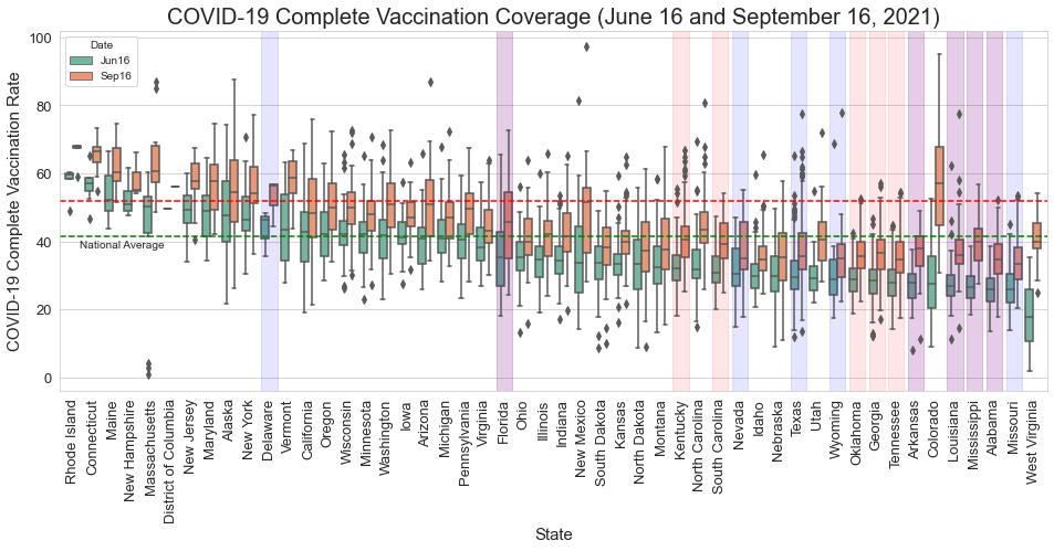
Figure 10. Complete vaccination rate on June 16 (green) and September 16 (red). Red shades mean the top 10 states with the highest incidence rate, blue shades are for the top 10 states with the highest mortality rate, purple shades are the overlap between two lists. (Vaccination Coverage Data Source: US COVID-19 Vaccination Tracking)
Conclusion
This study highlights the robust relationship between county level vaccination uptake and COVID-19 case incidence and mortality rates over the 2021 summer, during which time the highly infectious Delta variant was widely circulating. We estimate a statistically significant negative correlation between complete vaccination coverage rates and COVID-19 case incidence and mortality rates when considering all US counties, as well as subgroups of counties based on certain shared characteristics. Overall, the modeling results reveal that communities with higher vaccination rates on average experience lower COVID-19 case incidence and mortality rates.
Critically, our analysis also reveals behavioral differences with respect to COVID-19 vaccine coverage rates amongst US counties, as well as disproportionate impacts of the virus. Specifically, counties that voted Republican in the 2020 Presidential election, are more rural, have lower average household income levels and education rates, and are more socially vulnerable are more likely to have lower vaccination coverage rates and higher incidence and mortality rates from COVID-19 over the summer period evaluated.
The reasons for the disparate vaccination behavior observed at the county level are likely due to a complex combination of individual-level perceived risks and benefits, beliefs, preferences, and information sources, among other factors that drive individual decision-making. For instance, US politics have played an unprecedented role in this pandemic, through influencing policy action (and inaction) and influencing individual-level decision making. Previous work revealed that democrats are more likely to live in dense urban areas, which are generally more vulnerable to infectious disease spread due to higher population densities, increased public transit usage, and other environmental settings (14). However, in this work we find that urban and democratic voting counties are on average experiencing less harm from COVID-19. As further evidenced by the political affiliation analysis, political partisanship is likely to be impacting vaccine acceptance, and as a result, increasing COVID-19 harm in republican voting counties. In addition, counties with lower household income levels are observed to have lower vaccination rates and higher COVID-19 case incidence and mortality rates. These findings are consistent with previous studies that found that higher income typically translates to more self-protective behaviors (15), and that income level may be negatively correlated with the risk of COVID-19 infection (16). We similarly find that counties with lower education rates, measured by the proportion of adults with less than a high school diploma, and counties that have a higher SVI, have lower vaccination coverage rates and higher COVID-19 case incidence and mortality rates.
It is important to recognize that although we reveal a strong, robust signal between the COVID-19 vaccination rates and incidence and mortality rates across counties, this analysis does not prove causality. However, the results are consistent with recent CDC findings, that vaccinated individuals are less likely to become infected and spread infection, and critically, much less likely to die from infection (17). Based on the findings in this analysis, the groups of high-risk counties, which primarily lie in the Southeastern region of the US, should be targeted for education and outreach campaigns, to inform the populations on the true risks and benefits of COVID-19 vaccines, in order to protect them from further COVID-19 harm.
References
- CDC COVID Data Tracker: https://covid.cdc.gov/covid-data-tracker/#variant-proportions
- The Possibility of COVID-19 after Vaccination: Breakthrough Infections: https://www.cdc.gov/coronavirus/2019-ncov/vaccines/effectiveness/why-measure-effectiveness/breakthrough-cases.html
- JHU CSSE GitHub Repository: https://github.com/CSSEGISandData/COVID-19
- US COVID-19 Vaccination Tracking: http://www.vaccinetracking.us/
- CDC COVID-19 Vaccinations in the United States, County: https://data.cdc.gov/Vaccinations/COVID-19-Vaccinations-in-the-United-States-County/8xkx-amqh
- US COVID-19 Vaccination Tracking – Data: http://www.vaccinetracking.us/data.html
- MIT Election data: https://dataverse.harvard.edu/file.xhtml?fileId=4819117&version=9.0
- US Census Urban and Rural Classification and Urban Area Criteria (2010): https://www.census.gov/programs-surveys/geography/guidance/geo-areas/urban-rural/2010-urban-rural.html
- Civic Impact Govex GtiHub Repository: https://github.com/govex/COVID-19/tree/master/data_tables/Data_for_UScounty_map
- USDA education dataset: https://www.ers.usda.gov/data-products/county-level-data-sets/
- CDC SVI: https://www.atsdr.cdc.gov/placeandhealth/svi/index.html
- Ruiz, Jeanette B., and Robert A. Bell. “Predictors of intention to vaccinate against COVID-19: Results of a nationwide survey.” Vaccine 39.7 (2021): 1080-1086.
- Fridman, Ariel, Rachel Gershon, and Ayelet Gneezy. “COVID-19 and vaccine hesitancy: A longitudinal study.” PloS one 16.4 (2021): e0250123.
- Allcott, Hunt, et al. “Polarization and public health: Partisan differences in social distancing during the coronavirus pandemic.” Journal of Public Economics 191 (2020): 104254.
- Papageorge, Nicholas W., et al. “Socio-demographic factors associated with self-protecting behavior during the Covid-19 pandemic.” Journal of Population Economics 34.2 (2021): 691-738.
- Abedi, Vida, et al. “Racial, economic, and health inequality and COVID-19 infection in the United States.” Journal of racial and ethnic health disparities 8.3 (2021): 732-742.
- Science Brief: COVID-19 Vaccines and Vaccination: https://www.cdc.gov/coronavirus/2019-ncov/science/science-briefs/fully-vaccinated-people.html?CDC_AA_refVal=https%3A%2F%2Fwww.cdc.gov%2Fcoronavirus%2F2019-ncov%2Fmore%2Ffully-vaccinated-people.html